Photographs by Frank

27 January 2023

Alt Print Exchange

Filed under: Alternative Processes,Cuprotype — Frank @ 11:30 PM

Several weeks ago I agreed to participate in an alternative process print exchange that was organized on one of the on-line fora I frequent.

A print exchange in its simplest form, means that a group of people agree to send a print to each of the folks who participate. In this case nine folks (including myself) enrolled; eight of us are from the US and one from The Netherlands.

I spent a full day on Wednesday printing cuprotypes for this exchange. Yesterday, I trimmed the prints, signed them and packaged them. This morning I took the envelopes to the post office.

The ‘rules’ of the print exchange require one to send a single print. However, being an overachiever (Ha!) I decided to send three prints*… one photo each from the three northern New England states, each toned differently.

I chose to send cuprotypes as this process is not commonly used even among experienced alt process printers. Thus, I figured I could do a little evangelizing for this interesting, inexpensive and relatively simple process.

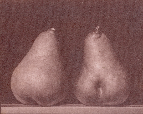
Stalwart readers will recognize all of these photographs and may even remember seeing them as cuprotypes in the past. I make no apologies for the repetition. They should be ‘new’ to the members of the print exchange

The Bellows Falls image and the Tiptop House image are older exposures (from January 2012 and September 2013, respectively) that I knew looked good printed in the red-brown of cuprotype.

The Tiptop House print was supposed to end up a chocolate brown tone rather than the red-brown of the untoned print. Obviously this toning method did not quite work as planned. I’m not sure why but I have a hypothesis. I won’t bother describing all of the technical details and glitches here.

The Burnt Head image is from our trip to Monhegan Island this past June. I was hoping that it would look good in the more neutral tone of a cuprotype treated with an iron-based toner.

* Really, I was having trouble on narrowing down the choices!!!!

21 December 2022

2022 Winter Solstice Print

Those of you who have been following this blog for some time are probably familiar with my ‘Winter Solstice Print” tradition; if you are not I refer you to this post, where there are some details.

This year’s print (the tenth) is a cuprotype, titled “Two Pears”.

In late August, Joan picked the remaining pears from the tree in our yard because the local squirrels were decimating the crop. I had been experimenting with cuprotype since early August. Watching these pears on the kitchen counter for several weeks, I decided that a photograph of the pears was an apt subject for the warm tones of cuprotype and went to work. The exposure was made on 13 September 2022 in my basement studio.

This scan does not do justice to the originals which do not have the ‘grain’ seen here. However, I seem to have neglected to save a print for myself and thus can not make a better scan!!!

10 November 2022

Two New Cuprotypes

It has been three weeks since my last post. I figured that I ought to post something… anything. So here goes!!!

November is often a slow month for me photographically. The landscape is dreary gray and brown. The odes are done for the season. However, I have made exposures on four days since my last post. I just hadn’t found time to write here.

One of the ‘distractions’ has been some more cuprotype experiments. However, a couple of days ago, I decided that it is time to stop doing experiments and, instead, to make some ‘art’.

Yesterday evening I printed two negatives using exposures I made about a week ago. This morning I printed these negatives as cuprotypes. My intent was to tone both prints with the iron (II/III) toner that yields an interesting blue-black print. However, I decided that I liked the cemetery gate image as the native brick-red. Thus, I did not tone this print further. One need to be flexible when making art!

These images are both 6×7.5 inches on 8×10 inch paper. The gravestones are on Legion Lenox 100 paper and the gate is on Rives Heavyweight paper.

[scrollGallery id=893 – autoscroll = false width = 600 height = 600 useCaptions = true]

27 September 2022

Two New Cuprotypes / Teaching Announcements

Filed under: Alternative Processes,Cuprotype,Monadnock Region — Frank @ 11:05 PM

I have not had much time for photography over the past several weeks. We have been doing major maintenance (replacing flooring and other carpentry projects) at our cabin on Gregg Lake. These days, I am not much good for anything else, including photography, after five or six hours of hard physical labor.

I did, however, steal a few hours on Sunday and Monday evenings to make some cuprotypes. I coated paper on Sunday and made the exposures yesterday.

The pear image is the first image I conceived as a cuprotype from before I triggered the shutter. The scan doesn’t do the actual object justice, which is not as grainy as seen here.

The Antrim Grange is the oldest building in town. It is currently sites at the foot of Meetinghouse Hill. It was originally built (in 1785) as the town’s first meetinghouse at the top of Meetinghouse Hill and moved to its current location when the Grange purchased the building in 1894. The building is currently undergoing some much needed maintenance.

On a different note, I have agreed to teach a two-day workshop on cuprotype at the Vermont Center for Photography (VCP) in November, details here. Additionally, I will also be teaching a class titled “Lightroom for Beginners” at the VCP (three weekly sessions) at the end of November and early December, again details here.

[scrollGallery id=889 – autoscroll = false width = 600 height = 600 useCaptions = true]

5 September 2022

More Cuprotypes

Filed under: Alternative Processes,Cuprotype — Frank @ 7:30 PM

I have spent some time since my last post (two weeks ago!) exploring/experimenting with cuprotypes. I have tried a number of negatives, a number of papers and even made a cuprotype on cloth.

I have decided that this alternative process has most of the characteristics of a good process for beginning alt process printers. Thus cuprotype offers an interesting alternative (to cyanotype*) in teaching this realm of photography.

The materials for cuprotype are inexpensive. It is easy to coat paper with the sensitizer and one can use a wide range of papers as they come from suppliers for cuprotype. Furthermore, the processing of exposed paper is relatively simple (although it is more complex that cyanotype).

All of the prints shown here are smallish prints such as I typically make. However, given the simplicity and inexpensiveness of the process, I have also made a couple of 11×14 inch cuprotypes**. These are the largest alternative process prints I have even made. Exciting!

Last Saturday, I showed these cuprotypes to my monthly print sharing group which meets at the Vermont Center for Photography (VCP) in Brattleboro. The folks at the VCP have twisted my arm and I’ll be teaching a workshop on cuprotype there this fall. This is in addition to the beginning Lightroom class that we already had in the works. The details of both of these events will be published on the VCP website when we get everything finalized. Once a teacher, always a teacher, I guess!

[scrollGallery id=888 – autoscroll = false width = 600 height = 600 useCaptions = true]

* Cyanotype is the typical entry point into alternative process printing. Being iron based, it is inexpensive and the ‘mechanics’ of the process are fairly simple. Many folks never progress to the more complex and expensive processed which involve precious metals (silver, platinum, palladium). Cuprotype is much closer to cyanotype in its cost and complexity than it is to the other alternative processes. Lastly, Cuprotype with its red/brown tonality is a good adjunct to the blue of cyanotype.

** I don’t have a scanner larger enough for 11×14 inch prints, so folks will have to come for a visit to see them!

15 August 2022

Nothing Precious

Filed under: Alternative Processes,Cuprotype — Tags: — Frank @ 9:00 PM

I spent Saturday experimenting with a newly rediscovered and modified process for making prints.

The Obernetter process, first described in the 1860s, uses iron and copper* to make brick-red images on paper. The pigment produced by this process is, most likely, Hatchett’s Brown (i.e. Cu(II) Ferrocyanide).

Several years ago, this process was updated by Jim Patterson (see: https://www.darkroomdoc.com/post/cuprotype).

A couple of weeks ago, Jan de Young posted on PhoTrio.com the results of an ‘out there’ experiment involving the reuse of used photographic fixer to make a print from a negative. Initially, I (and others) thought that Jan’s process was a variant of Van Dyke brown printing.

One thing lead to another and another fellow, Niranjan Patel (whom I have never met but that I feel I know well from his presence on various alt photo sites) posted to the altphoto email list, his take on these processes. Niranjan made the key discovery that silver (from the spent fixer) plays no role in this process and thus these images are not at all related to Van Dyke brown prints but rather are more accurately described as cuprotypes (i.e. copper-based images).

I won’t bore you with the technical details as I have posted them to the altphoto email discussion cited above. However, here are three examples on three different papers.

All three prints were made using the same chemistry. The reason for the different hues in final prints is unknown as yet. I’ll be trying a few more experiments in an attempt to understand these differences. However, given the vagaries of these alt processes we may never know.

[scrollGallery id=887 – autoscroll = false width = 600 height = 600 useCaptions = true]

* Thus the title of this post… nothing precious as in no precious metals (e.g. silver, gold, platinum or palladium)!

Powered by WordPress